
In Canada, the government has been providing daily updates and two graphs show different parts of the COVID-19 story. The first graph shows the total infections curve.

This shows that the infections curve may be peaking. This is the curve that they talk about flattening. To be clear this number will only go up unless one of three situations arise:
- Infected people go into remission (i.e. are 'cured')
- Infected people die
- No new infections occur
This is different from the curve below, which shows even more positive results for the number of newly reported cases by day:
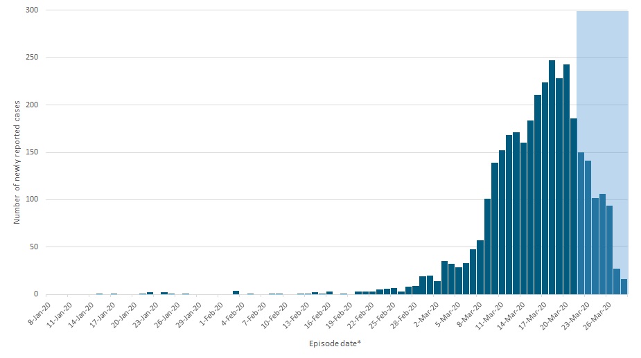
The daily new infections appear to have already peaked in Canada. This shows that newly reported infections have dropped off considerably. That means either social distancing is working, Canadians are not testing enough, or are reporting less due to social distancing. The latter two scenarios seem less likely, although there may be a combination of effects in play.
In any case, my main point is that the same data can be interpreted in different ways. That's important to keep in mind.

No comments:
Post a Comment
Disagreement is always welcome. Please remain civil. Vulgar or disrespectful comments towards anyone will be removed.